12 comments
Comment from: huijie
Comment from: Dave Atkins
I really like this skin; very clean and simple…but the styling for recent posts/recent comments, using the Post List/Comment List widgets breaks/does not render multiple lines. If the title of a post is wider than the sidebar, the text overwrites the post below it. The vertical height of these cells is apparantly fixed, so it looks very crappy when this happens…at least in Firefox. See my blog to see what I mean before I replace this skin with another…
Comment from: Adre
nice skin
Comment from: batu
thankyou for sharing..
Comment from: Antoinette Depont
These skins are absolutely beautiful - they give me shivers in my pyjamas! I think I’m going to have to go into my conservatory and sit around my
propane fire pit to warm up a little as I’m getting goosebumps! The greenery is just so liberating - love it! Antoinette
Comment from: christine
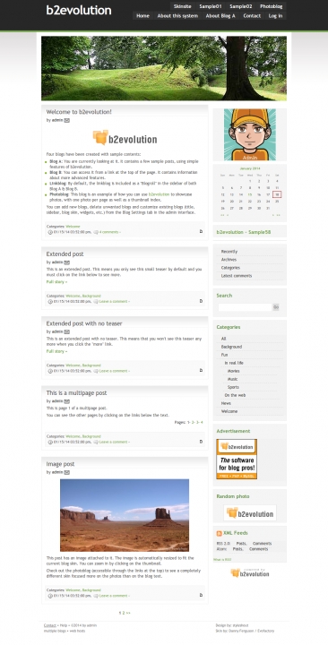
What a lovely clean and crisp skin. I think my readers would enjoy this look. Thanks for the share
Comment from: custom tents
Nice skin, I’m going to swap out the top picture and use it on my site. Thanks a lot!
Comment from: Emily Baker
This skink looks beautiful in Firefox version 3.6.16.
Cheers, Emily Baker
Comment from: Darren Brown
What’s best about this skin is how uncluttered it is. It presents the posts in a clean, easily readable format. It seems that in the last two years many skins/themes have gravitated towards cramming as much stuff as possible onto the home page. While this results in snazzy designs, what really matters - the content- is often buried. A good skin should highlight the content above all else.
Comment from: Adam
Really like the header and the way the sidebar is set up. Great looking theme.
Comment from: Jemma Irons
Nice minimalistic skin, perfect for a blog…..thanks for sharing.
Comment from: canopies
I love the skin, can’t wait to use it!


I run into a problem with this Skin under IE6. The top background image (the black bar with a green bottom line) re-appears once right under the section of the title photo. Viewing this demo site would reveal this problem already.
It looks perfect under IE7 and Firefox, though.
I know there is warning for IE6 in general. But just wondering if this is something you can fix. Thanks.