16 comments
Comment from: Ben Borges
Comment from: guido waldenmeier
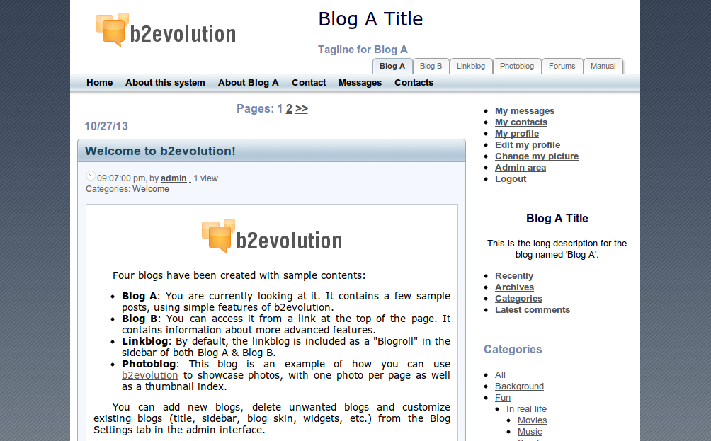
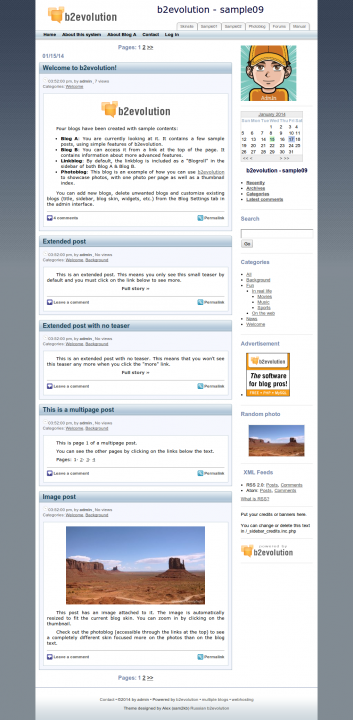
this are my real favorite one of the 2x skins
give me more space for my computer art ;)
love it
real good job done
kudos to the designer s ;)
Comment from: Mark Tomlinson
I like this one I am rediscovering b2 and this is a very clean theme.
Comment from: Ste
Ive used this theme for 4 of my sites, very good one
Comment from: Vladi B
Thanks Alex!
Nice skin and great job!
I’ve been using your skin for 2 my sites for quite while and pretty happy. Crystal clear design and usability. Look forward to hear from you about your new skins! Regards, VB
Comment from: alex
Thanks to everyone who posted here. I’m planning to release an updated version compatible with new features in b2evolution 4
Comment from: Juri
Tthank you for sharing… I really like this skin; very clean and simple…but the styling for recent posts/recent comments, using the Post List/Comment List widgets breaks/does not render multiple lines. If the title of a post is wider than the sidebar, the text overwrites the post below it.
Comment from: Hans
Great skin, with eye contact for the specifict categories, it is better for the public info, couse someone will interest to go down every detail post.
Thanks
Comment from: Manu
This skin is really great.
Thank you very much for sharing it..it is
perfect for my update releasy the next days.
But what’s with te problem posty by Juri?
Is there already a solution available?
Comment from: alex
Still need to find time and upgrade the skin to support new features of b2evo v4 and v5
Comment from: Jo
This would be very great @sam2bk!
I like the skin and some new features sounds really nice!
Comment from: zebulon8

Installed in 5.0.6 but many issues like no in-skin edit, User profile shows up screwed up,…
Comment from: mgsolipa

@ralf the issues you reported has been fixed. I invite you to download this skin again and test it, if you find any other issue, please tell us.
Regards!
Comment from: zebulon

Better now except that the public blog list is not showing in 5.1.1 beta6
Also - more left and right margins (especially for contacts and messages) but benefit the overall look.
Comment from: mgsolipa

@Ralf thank you for reporting, the bug have been fixed. Right now, we are providing just a minimum support for third-party skins, so the design matters will not be addressed. However, if you are not able to modify the margins by editing the css files, please create a new topic in the forums.
Regards!
Comment from: mgsolipa

Version 1.1
- Restored the tabbed public blog list at the header for version 5.1+


This is looking great :) really fresh :)